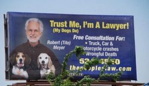
Those of us in the marketing industry tend to cringe when we’re driving along a road and see a poorly-designed billboard. Instinctively, we know a company has wasted money on something that doesn’t clearly communicate its message and call to action (and often gets ignored entirely because it’s unreadable!).
Take, for example, a couple of these bad lawyer billboards from CourtsAndSports.com. Do you see how they fall short of being great advertising?


So what does make for effective billboard advertising? We turned to Lynn Forbes, our Creative Director, and Korey Swift, our Lead Designer, for some thoughts and comments.
First, you need to identify what you want the ad to do for your business. Are you trying to insert yourself into a new market or area of town that you don’t typically get business from? Is your ad aimed at generating more foot traffic into your store? It’s important to establish the primary objective to provide design direction and streamline the design process.
It needs to be a clean, easy-to-read design. “And not just easy to read on a computer screen – pull up the design on your computer, then walk across the room and try to read it. If you can’t read everything, it’s not a good design.” Lynn says.
When a driver is on the road, they’re only going to look at your billboard for a second or two (unless at a red light – more on that in a moment). You need to maximize that time by taking out any guesswork for the reader.
So what lends itself to a good design?
- Typically 3-5 words in a bold, thick font
- Colors that make it easier to read – contrasting colors often work well
- Simple, without distractions
There also needs to be a clear call to action. Ask yourself: What do you want your target audience to do? It’s crucial this call to action is prominent and identifiable. Lynn mentions that a web address or directions tend to be more effective than a phone number: “People are driving, so they’re probably not going to write or type your number, and they can get that information online anyway.”
So, what about a busy intersection where cars are often stopped at a red light for 30 seconds or more? The same concepts apply. “You still want people to want to read your billboard,” Korey says. “Especially with digital billboards becoming more commonplace – your ad only shows for 10 seconds at a time on those, and you still do want to capitalize on the times when the light is green, anyway.”
Finally, there are two bonuses that can elevate an ad: extensions, and cleverness.
Extensions are additions to the ad – whether making it larger than the board, or adding other things it. Think of a typical Chick-Fil-A billboard – what do they typically have? Those cows are classified as extensions and often grab a person’s attention…even when on the road!
Being clever makes an ad more relatable to your target audience. “It brings entertainment, which often makes it stand out more,” Lynn says. “But remember, it HAS to relate to your message, or it’s only entertainment and nothing else.”
With that being said, here’s some recent outdoor advertising we did for a local chocolate shop that’s a few doors down from our office, La Bonbonniere.

“It’s a simple design that catches your attention – while making you do a double take and think ‘Where can I buy that delicious-looking chocolate?’” Korey says of her design. “It was a great billboard for right before Valentine’s Day and worked well for the client.”


